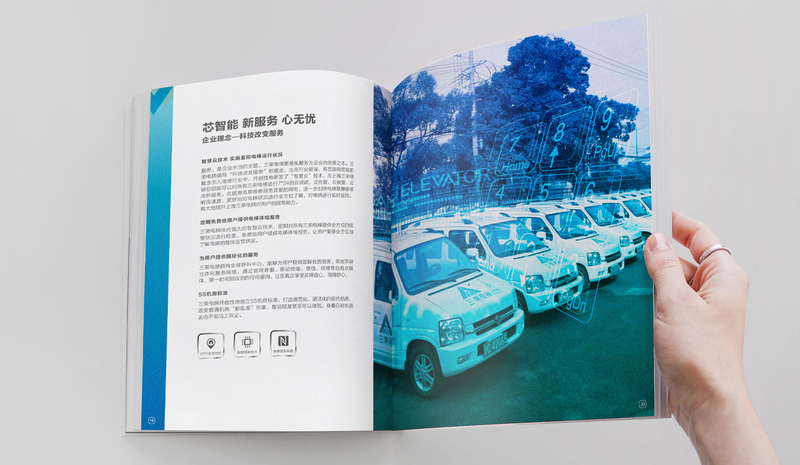

An excellent corporate brochure should be designed like this
When an excellent corporate brochure design is in front of you, the first thing that attracts you is the overall image of the brochure, and the layout of the corporate brochure is a key factor related to the overall image of the brochure.
The most important thing in corporate brochure design is to convey company-related information. Corporate brochure design and layout needs to show the characteristics of the company and products, show the continuity of design style and design elements, artistically express the front and back covers, and make pictures of the inner pages. Proper arrangement of text placement.
1. Picture display type. For some high-end technical products, it may be difficult for the general public to distinguish the quality of the products described in the brochure from the specific parameters. That is to say, when organizing the content, the product outline can be reduced in length. , or even omit it, and mainly display the renderings of the product in the layout design of the inner pages of the album. This approach to typography is particularly suitable for well-known brands.
2. The rules of silhouette typesetting, as the name suggests, are to use a slightly skewed angle to break the rigidity caused by the existing square structure while ensuring that the picture is stable at the same time. Equipped with corresponding text, one is to introduce the picture, and the other is to enrich the picture.
3. From simplicity to elegance, the design concept of "less is more" was first proposed by the German architect Mies van der Rohe. The "less" in album layout design is not a large area of white space, but a large area of blank space. The few elements used, and the proportions between different elements are harmonious (the ratio of true to false is 4:3). The simple pages are often used to differentiate between different chapters of the entire brochure, or to intersect between them, as a way to digest the detailed content, so as to relieve the visual fatigue caused by the large-area content.
What are the rules of layout design in corporate brochure design? A simple way to understand the rules of layout design in corporate brochure design is to meet the minimum requirements of layout design. You can’t put the title in the center of the article, right? Maybe put the picture upside down. The actual meaning of corporate brochure design is to allow companies to gain greater gains from a fiercely competitive society.


Leave a reply